


Where Did the Color Go? Screens, Neutral Design, and the Search for Visual Quiet
Gray cars, muted interiors, colorful screens: the contrast invites a theory about digital overstimulation. The research points to a more complicated story about perception, choice, and the environments we buy.

For its 2026 Color of the Year, Pantone chose Cloud Dancer, a white. The company describes it as “a whisper of calm in a noisy world,” connecting a restrained palette with simplification and reflection. That is a commercial interpretation of the cultural mood, not a scientific demonstration that white helps an overstimulated brain recover. Nevertheless, it raises a revealing question: why is visual quiet something we are being sold? [1]
Imagine sitting in a muted living room while a phone presents bright icons, videos, advertisements, and messages. The room changes little. The screen keeps offering something else to see.
One explanation is tempting: perhaps color has not disappeared so much as moved. We get stimulation from digital media, then choose surroundings that ask less of us. Our homes become a counterweight to our feeds.
The sources reviewed for this article do not establish that causal relationship. They document neutral dominance in particular markets, show that color can influence emotional responses under controlled conditions, and reveal deliberate choices about where color belongs. None demonstrates that years of exposure to vivid screens caused consumers to buy gray sofas or paint their homes beige.
The investigation begins with three separate questions: What has actually become less colorful? Why do people choose those things? And how much of that choice is theirs?
A gray parking lot is evidence, but not the whole world
Automobile production supplies a concrete measurement. Axalta’s 2025 Global Automotive Color Popularity Report assigns 29% to white, 23% to black, 22% to gray, and 7% to silver. Together, those categories account for 81% of the production represented in its data. The company bases its report on automotive build information from major production regions and markets. [2]
That supports a precise claim: achromatic colors dominate this automotive dataset. It does not establish that architecture, clothing, furniture, and consumer electronics changed at the same rate, for the same reasons, or even in the same direction. A production share is also not a survey asking why somebody wanted a particular finish.
The recent picture is not uniformly gray. BASF’s separate analysis of 2025 automotive production identifies green as the fastest-growing chromatic color worldwide while gray gained two percentage points. In the Americas, the share of chromatic car paints increased by almost two points. These are separate industry analyses, not interchangeable measurements. Both complicate a simple story of disappearing color. [3]
Interiors require their own evidence. The 2026 U.S. Houzz Kitchen Trends Study, fielded in July 2025 among 1,780 U.S. Houzz users planning, undertaking, or recently completing a kitchen renovation, found wood cabinetry selected by 29%, edging past white at 28%. Wood rose six percentage points from the previous study. The sample describes renovating Houzz users, not every American home. [4]
A shift from white cabinets to wood can introduce warmth and texture without producing a vivid rainbow. Calling both options “colorless” would hide what changed. Before declaring that color has left physical design, we need to decide whether we mean fewer hues, lower saturation, less contrast, or simply fewer objects that demand attention.
The screen-compensation hypothesis

Call the proposed relationship screen compensation: exposure to demanding digital environments might increase a person’s preference for quieter physical ones. That is a hypothesis to test, not an established diagnosis of contemporary taste.
Its central problem is that “visual stimulation” bundles together different things. Wilms and Oberfeld’s color experiment manipulated hue, saturation, and brightness separately because these dimensions can have different effects. A vivid hue, a bright display, and a crowded interface are not the same variable. [5]
Imagine two comparisons. First, a saturated blue wall and a pale blue wall, equally illuminated in otherwise identical rooms. Second, a quiet photograph on a screen and a monochrome feed packed with movement and interruptions. The first tests a palette difference. The second changes activity and demands on attention. Combining them would make it difficult to tell what people were responding to.
Nor should “visual energy” be treated as a fixed daily allowance of color. A review of digital eye strain by Amy Sheppard and James Wolffsohn describes mechanisms involving ocular-surface problems and the demands of sustained focusing and binocular vision. It does not establish a biological color budget that is replenished by beige interiors. [8]
Someone might reasonably want a quieter room after an exhausting day. What remains uncertain is whether the desired relief comes specifically from less color, rather than fewer interruptions, less clutter, lower glare, a change of task, or greater control over the environment.
What color experiments actually tell us
In a study published in Psychological Research, Lisa Wilms and Daniel Oberfeld tested 62 participants using colored displays that varied hue, saturation, and brightness. Each color appeared for 30 seconds. More saturated and brighter colors were associated with higher reported arousal, but also with more positive evaluations. The researchers also recorded physiological responses. [5]
That result does not mean every vivid room is beneficial, or that increased arousal is necessarily uncomfortable. It shows why “more colorful” cannot simply be translated as “more stressful.” The experiment concerned short exposures to controlled stimuli, not a lifetime of screen use or an actual home purchase.
A different experiment, published in Color Research & Application, tested 170 high-school students in four ambient-color conditions: commercially named pink, red, blue, and white. Christoph von Castell and colleagues did not find the predicted color-related effects on cognitive performance and emotion. That is not proof that color never matters. It is evidence against assuming that a color’s promised psychological effect will reliably appear in every setting. [6]
Taken together, these studies make universal decorating prescriptions difficult to defend. A paint name can promise relaxation. A person can genuinely like the result. Neither establishes that the hue itself caused a measurable recovery from screen fatigue.

Another explanation emphasizes meaning. Stephen Palmer and Karen Schloss’s ecological valence theory, published in PNAS, proposes that color preferences relate to how people feel about objects associated with those colors. Their experiments provide evidence for that account. It is one explanation of preference, not a complete theory of why everyone chooses a particular sofa. [7]
Its implication is important: color is not only an optical stimulus. A shade can also suggest a place, an object, or a remembered experience. A green room might appeal because it evokes a garden, not because its occupant needs to compensate for time spent online. Testing screen compensation would have to distinguish those explanations.
Who chose the neutral room?
There is a second risk in making this a story entirely about brains: overlooking the decisions that happen before a person moves in or makes a purchase.
Consider a hypothetical apartment. Its developer chooses the flooring. A landlord chooses the paint. A retailer stocks a limited selection of affordable sofas. The occupant then chooses among what is available and permitted.
Even if the finished apartment is neutral, that observation alone cannot reveal whether its occupant requested visual recovery. Preference, budget, inventory, and permission are different explanations that can produce a similar-looking result.
Resale expectations, perceived versatility, maintenance, trend forecasting, and the desire to appeal to multiple customers are competing explanations to investigate. The revealing question is not simply whether gray feels calming. It is who chose the gray, what alternatives they had, and why those alternatives lost.
This also changes how we interpret design photographs. A carefully selected set of muted rooms can make neutrality appear universal; a carefully selected set of vibrant rooms can suggest the opposite. Neither selection supplies the denominator. To measure a trend, researchers would need comparable samples across dates and places, consistent color measurements, and a way to account for photographic processing.
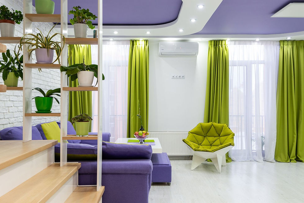
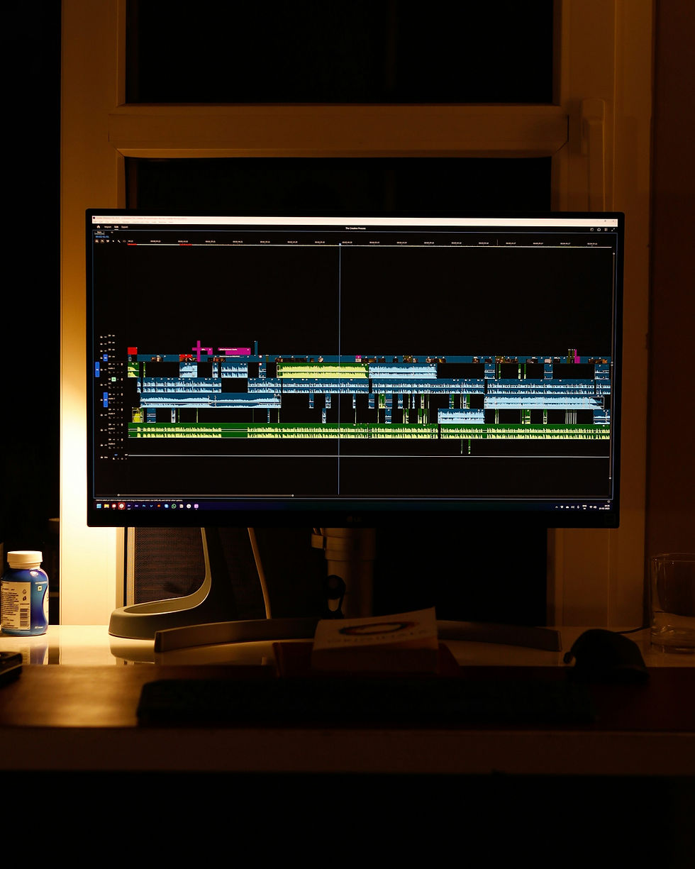
The photographs accompanying this article are illustrative stock images. They were selected to explain the questions, not sampled to measure a population. They do not document the rooms used in the cited experiments.
Technology does not always remove color. Sometimes it relocates it
Apple provides an unusually explicit example of selective placement. Its October 2024 announcement of the M4 iMac described seven finishes. The backs used bolder colors, while the fronts used a subtler palette that the company said was intended to help users focus. That is a manufacturer’s stated design rationale, not the result of a controlled concentration study. [9]
The product did not eliminate physical color, yet it deliberately moderated color near the working display. The design problem was not simply whether to use color. It was where to place it and which surface should command attention.
The same question can be asked of a room: does a restrained background provide welcome breathing space, or does it make the screen the strongest competing object? Both are possible interpretations. Neither demonstrates that technology companies caused people to redesign their homes around a display.
It is also a warning against a false binary. Digital design does not have to be vivid, and physical design does not have to be quiet. The useful unit of analysis may be the whole scene: screen, walls, lighting, furnishings, task, and person.
The missing experiment
A useful test would begin with participants’ existing preferences, then vary screen exposure while independently controlling brightness, saturation, movement, visual clutter, and task difficulty. Afterward, participants could evaluate physical environments matched in lighting, layout, and furnishings but differing in palette.
Researchers would need to distinguish liking from restoration: choosing a room, reporting calm, recovering attention, and showing a physiological change are different outcomes. They should also test whether the effect lasts beyond a brief session and whether it changes actual decisions rather than only ratings of photographs.
Longer-term research would need to account for who can afford to redecorate, who rents, which colors are available, and how preferences differ across places and life stages. Heavy screen use and neutral homes occurring together would still leave open the possibility that age, occupation, income, or another factor helps explain both.
None of the research reviewed here supplies that full causal chain. The gap makes screen compensation an open question; it does not turn it into either an established explanation or a disproved idea.
A different question for media creators
For photographers, filmmakers, and designers, the practical lesson is not to remove color. It is to be more deliberate about what is allowed to compete with the subject.
A vivid image can sit inside restrained page navigation. A colorful set can use repetition and clear composition rather than a multitude of unrelated accents. Conversely, a mostly gray interface can still become demanding through dense information and constant movement. These are design propositions to test with audiences, not universal claims about nervous systems.
There is also a reporting responsibility. An image of someone beside a screen cannot tell us how fatigued that person feels. A muted room cannot tell us why its owner selected it. Color grading should not manufacture a desaturated “before” or hyper-saturated “after” to make the argument look stronger than the evidence.

The story is larger than the supposed disappearance of color. It concerns how we divide attention between environments that remain around us and media that keep changing before us.
Current evidence establishes neutral dominance in a major product category, movement toward wood in one renovation sample, and context-dependent psychological findings. It does not justify the verdict that smartphones made the physical world beige.
A better closing question is not whether people need less color. It is whether they need more choice over what asks for their attention.
Perhaps visual quiet is not the absence of color. Perhaps it is the freedom to decide what gets to be loud.
Sources and reporting notes
This document-based feature was developed with AI-assisted research and drafting. It does not contain original interviews. Industry reports describe their own datasets; company statements document marketing language or design intentions; research findings are limited to the study designs described. The sources reviewed do not establish that screen exposure causes a preference for neutral physical surroundings.
All five photographs are illustrative stock images, not documentation of the cited experiments or specific products discussed. No images were generated for this article. Photographer credits and original source links appear with each image.
Photo-use terms: Pexels License. The photographers and depicted subjects are not represented as endorsing this article.

Comments